Sponsored
While working with the team at Penley Estate throughout 2016 in relaunching their brand, the team at Parallax Design kept hearing whispers about a truly fantastic cabernet that winemaker Kate Goodman was putting together.
“A bottle presented to us early this year confirmed the rumours – the wine inside represented the very best cabernet sauvignon of the vintage,” Parallax managing and creative director Matthew Remphrey says.
“It was the icon wine Penley needed to lead its entire portfolio.
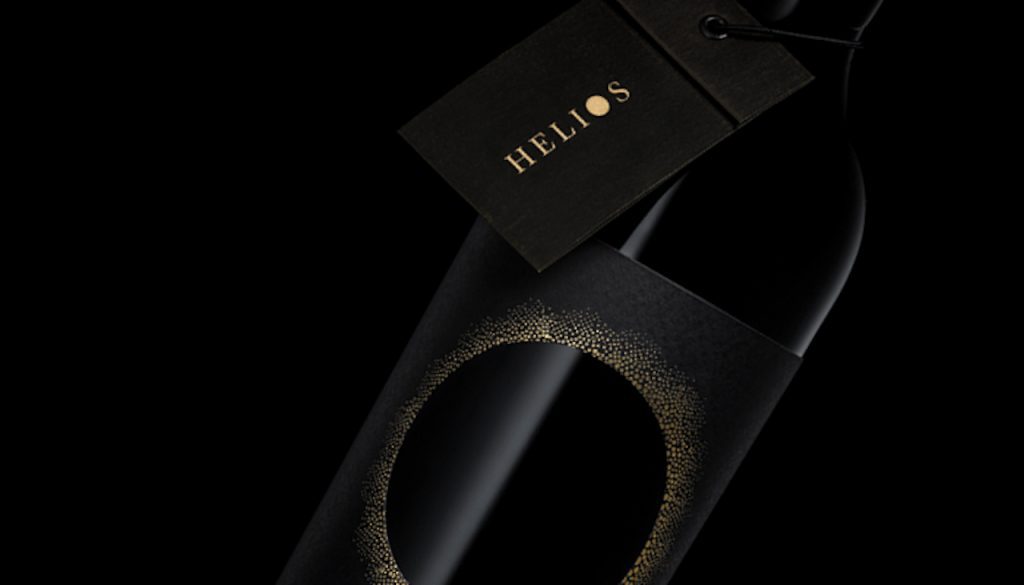
“In keeping with Penley’s sun logo and mythological themes, the wine was to be named Helios — the personification of the sun in Greek mythology.”
Penley’s labels all depict the sun as a golden orb.
“For Helios, a circle die-cut, showing the bottle through the label, is ringed with a golden halo of light. The sun is eclipsed by the wine itself,” Matthew says.
Manter Black Pepper Ultra label stock, gloss black high build screen, wax seal and a neck booklet containing tasting notes and mandatories, completes the package.
For further information visit www.parallaxdesign.com.au
• This article first appeared in the Design Clinic in the July-August issue of WBM – Australia’s Wine Business Magazine. To subscribe visit www.wbmonline.com.au/shop
Related content
