SPONSORED
Every wine brand has a unique story to tell. For over 16 years, Damian Hamilton, brand keeper and designer at Cornershop has helped create many iconic wine brands, both domestically and internationally. “Our purpose is to create brands that tell a genuine, unique story that emotionally connects with people, and ultimately helps our clients grow,” he says.
“We believe what’s on the outside of the bottle is just as important as what’s inside. People do judge a book by its cover. It is our role as brand and packaging designers to help sell that first bottle of wine to a new consumer. If the package design is memorable, ideally a conversation-starter at the dinner table, and the wine tastes great, they will be back for more.”
With this in mind, it’s integral that your packaging design communicates the right message. An effective design will reflect the quality of what’s inside the bottle, and it should express the products’ price point and engage and inspire the target consumer. Cornershop are there to help, and we met with Damian to find out how.
How can Cornershop help?
“We create brands based on strategic creativity. By listening, asking the right questions, conducting research and collaborating with our clients, we position a brand to be distinct and create a competitive advantage. Of course a brand is much more than a label on a bottle. Our role extends beyond the label design; from websites to email marketing, cellar door signage and environmental design, staff uniforms and more. As brand keepers, we build long-term relationships with our clients to ensure their brand story is clearly and consistency told across all consumer touchpoints.”
Case in Point
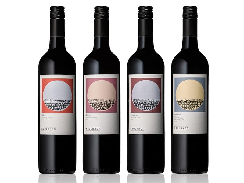
Cornershop’s packaging design solutions range from contemporary to classically inspired, always with the consumer in mind. Their designs come highly awarded, such as their recent works for Barossa wine brand Moolanda, which snapped up distinction awards at the Australian Design Biennale.
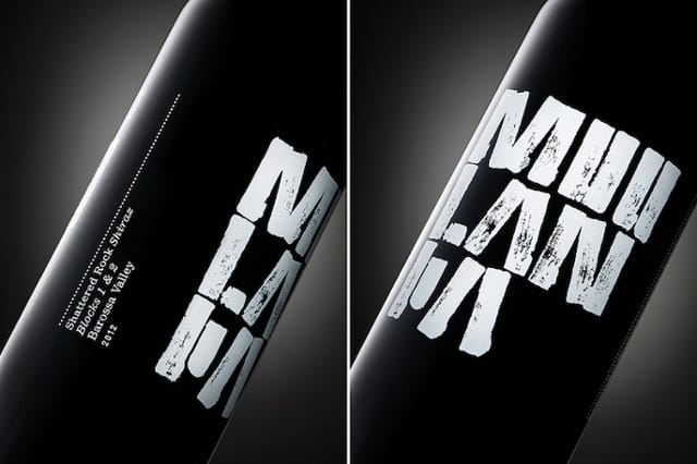
Moolanda’s branding tells a story about the terroir and the vineyard’s Aboriginal connection. The illustration on the core range of labels features dots that represent shallow layers of soil over layers of rocks; unique attributes of the Moolanda vineyard. ‘Shattered Rock’, Moolanda’s finest wine, features an understated, abstract design inspired by shards of rock. The graphics have been screen printed in white directly on the bottle and a complementary cigar band adds to the premium statement.
Albeit a small business, Moolanda’s packaging designs have won big. The core range of labels and Shattered Rock were awarded at the 2014 Australian Design Biennale. The core range packaging was also selected as one of the ‘200 Best Packaging Designs Worldwide’ and published in the 2015/16 edition of Lürzer’s Archive.
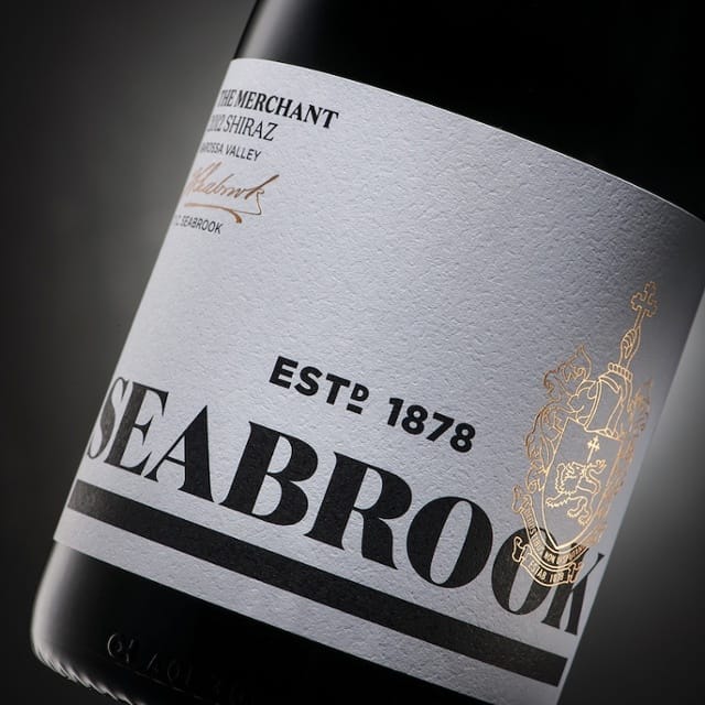
Another Barossa Valley brand that Cornershop have helped pioneer is Seabrook. “We were appointed to reposition the Seabrook brand and revitalise the premium range packaging design to be more contemporary whilst maintaining the family’s heritage,” Damian says. “The objective was to engage a younger audience without alienating the existing older consumer.”
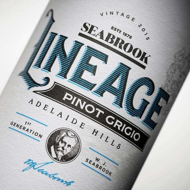
The Seabrook family have been involved and respected in the Australian wine industry since 1878. Each product in the premium range pays homage to a generation of the Seabrook wine industry lineage and is distinguished by a unique name on the front label. Seabrook’s ‘Lineage’ label builds on the brand story further, featuring a playful design relevant to its younger target audience and cheaper price point.
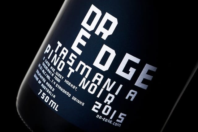
At the opposite end of the spectrum is a disruptive Tasmanian wine brand called Dr Edge; named after winemaker Peter Dredge’s brooding alter ego. The idea behind Dr Edge was driven by Peter’s personal experience and friends who have been afflicted by mental health issues. Peter wishes to grow Dr Edge as a non-profit brand, donating all profits to a mental health awareness charity of his choosing. Cornershop’s design solution features a custom designed typeface that reflects a fractured personality. “Every letter has been meticulously positioned by eye and stacked precariously to represent Dr Edge’s unbalanced personality,” Damian says.
To determine if the message on your bottle is lost, Damian recommends a quick self-evaluation:
- Who are you selling or communicating to?
- Does your packaging design communicate your unique brand story?
- Does the design emotionally connect with your target audience?
- Does it stand out from the crowd?
- Does it reflect the quality of the wine inside the bottle and its price point?
- Is the packaging design memorable?
>> Please contact Damian here to discuss how Cornershop can help add value and connect your brand with its audience, or visit the website http://cornershopdesign.com.au




Recent Comments