DESIGN CLINIC
While crafted packaging is designed to catch the eye, it’s the depth of market insight behind it that shines above the label, speaks to a specific consumer and helps win the battle for market share.
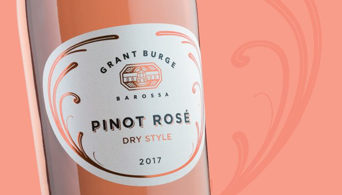
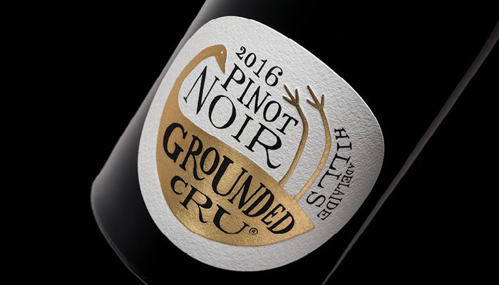
After completing an extensive brand audit and creative strategy for the Grant Burge brand, Tucker Creative was commissioned to create packaging for a new premium dry style Pinot Rosé offering.
While understanding and conveying the brand’s heritage is a core element, knowing precisely who to visually connect with and ‘talk’ to is vital. The audience was not simply ‘Millennial’ but a subset that are discerning and feel deserving of quality and discovery.
The design needed to reflect a mature, exclusive and successful brand that a female skewed market want to associate with. So distinctive packaging was a motivating factor.
Working with the warm hues of the Pinot Rosé, the resulting design employs a sophisticated copper foil motif leveraging design cues from the well-known Grant Burge Sparkling Pinot Noir Chardonnay and lifestyle range.
Branding creative and design developed with a living breathing customer’s emotional and rational perspective in mind adds the decisive edge.
• This article was first published in the Design Clinic feature in WBM – Australia’s Wine Business Magazine, where Australia’s best wine label designers showcase their finest work.


Recent Comments