Wicks Estate’s premium cool-climate wines from the Adelaide Hills have grown to be recognised as some of the finest the region has to offer through dedication to excellence from its co-founders, Tim and Simon Wicks.
Market research and trade interviews showed that Wicks Estate’s brand and livery were seen as “old fashioned” and not representative of the quality of their wines.
The brand suffered low awareness and had little uptake among younger females.
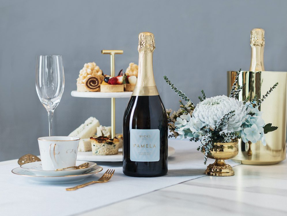
Pamela is dedicated to Simon and Tim’s mum and needed to be launched in time for a Mother’s Day release.
Parallax Design in Adelaide went to work.
The Wicks identity and packaging features a strong signature “W” chevron pattern and classic typographic language.
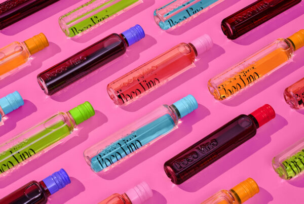
The colour palette needed to cut through a crowded shelf and is inspired by Pamela’s favourite colours.
Custom embossed hood, neck label and embellishments evoke prestige and finesse, just like the traditional method wine inside.
Related content


Recent Comments