
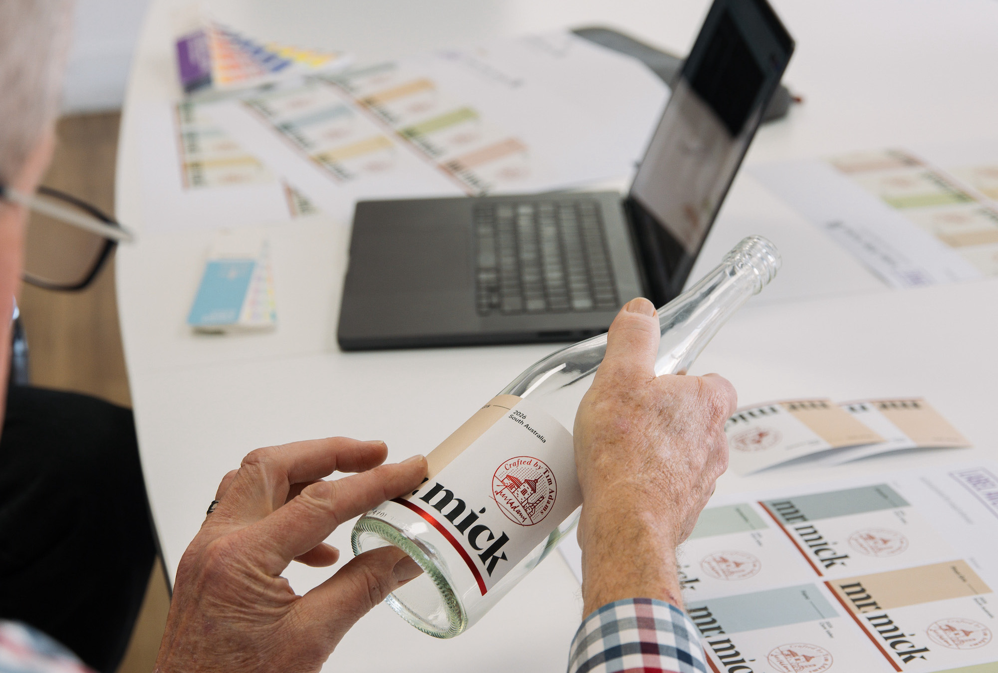
After more than 15 years on the shelf, Tim Adams Wines decided it was time to refresh its Mr Mick range – not because the wines had changed, but because the market had.
“For 15 years the brand had looked essentially the same,” says Tim Adams.
“Labels that aren’t deliberately designed to become classics need refreshing from time to time, and we felt 15 years was well and truly long enough.”
The decision came during one of the most challenging periods the Australian wine industry has faced in recent years.
Rather than waiting for conditions to improve, Adams saw the refresh as an opportunity to strengthen the brand’s position for the future.
“If everyone’s finding it difficult, then we need to work harder,” he says.
“Refreshing the brand now means that when conditions improve, we’re well positioned with a product that looks contemporary and relevant.”
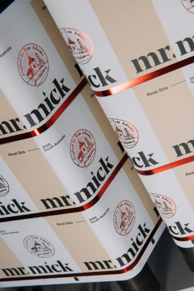
Although the previous labels had served the winery well, Adams believed they no longer reflected the quality of the wines inside the bottle.
“It had probably run out of shelf legs,” he says.
“We work very hard on the quality of our wines, and I don’t think the previous label portrayed that quality. This new look really lifts the value of the wine on the shelf.”
The brief was to modernise the range without losing the heritage that customers had come to recognise.
Designer David Byerlee of Byerlee Design says preserving that equity became the foundation of the project.
“Mr Mick has built strong brand equity over many years, so preserving that recognition was essential,” Byerlee says.
“Our role was to enhance the brand, not reinvent it.”
The redesign introduces a softer palette of pastel and earth tones, refined typography and the selective use of red foil to create a more premium appearance while improving shelf recognition across the range.
A key addition is an illustration of the historic Mr Mick Cellar Door and Restaurant in Clare, where the late Mick Knappstein mentored a young Tim Adams.
Byerlee says grounding the packaging in this iconic location strengthened the brand’s authenticity while celebrating its heritage.
“The brief was to carry over the tradition of Mr Mick while giving the range a more contemporary feel,” Adams says.
“We also wanted to strengthen the connection between the Mr Mick brand and Tim Adams Wines, while continuing to tell Mick’s story.”
Byerlee believes the finished design succeeds because it respects the past while making the brand more relevant today.
“A successful brand refresh isn’t about making a brand look different,” he says.
“It’s about making it feel more like itself.”

Bringing that vision to life required close collaboration between the winery, designer and printer.
Adams says the partnership between Byerlee Design and Label Avenue was one of the highlights of the project.
“The whole process has been really seamless,” he says.
“There was great cooperation between Byerlee Design and Label Avenue, and everyone worked together to achieve the best result while keeping costs under control.”
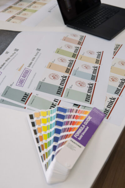
Throughout the development process, Label Avenue provided technical guidance on label construction, embellishments and production efficiencies to ensure the creative vision could be achieved without compromising commercial practicality.
Jamie Morrissey from Label Avenue says those conversations helped maximise the impact of the redesign while keeping the project within budget.
“We were able to find some efficiencies that focused on elevating the look of the front label without the need to increase the overall budget,” Morrissey says.
The collaboration enabled subtle refinements to the label specification that enhanced shelf presence, improved varietal recognition and delivered a premium finish while maintaining production efficiency.
For Adams, the finished result is a range that better reflects the quality of the wines while remaining unmistakably Mr Mick.
The project demonstrates how successful label refreshes are built not only on strong creative ideas, but also on collaboration between winery, designer and printer – combining brand strategy, thoughtful design and technical production expertise to create packaging that stands out in an increasingly competitive marketplace.
timadamswines.com.au
labelavenue.com.au
byerlee.com.au
• This article was first published in the July/August edition of WBM – Australia’s Wine Business Magazine.











Recent Comments